If you have even a moderately successful site, you’ll be visited by all kinds of people every day. However, you may have inadvertently alienated a large portion of your potential audience, by designing your site in a way that makes it difficult (or even impossible) for them use it.
Accessibility is an often overlooked but immensely important aspect of website design. By considering the challenges many people face when using the internet, such as visual impairments, mobility issues, and cognitive disabilities, you can take some simple steps to improve their experience.
In this article, we’ll discuss the importance of web accessibility, and explain how to test your site. Then we’ll talk about four ways you can make your website accessible to a wider audience. Let’s get started!
Why Making Your Website Accessible Is So Important
Accessibility is a vital aspect of site design. At its core, accessibility is about making sure your site is usable by as many people as possible. To do this, you’ll need to consider how people with various physical and sensory impairments will interact with your site.
There are several disabilities and conditions that can make a website difficult to use or read. Some of the most common ones include:
- Visual impairments, such as the inability to see or to perceive color contrast.
- Motor and mobility difficulties, whether permanent or temporary.
- Auditory impairments, including the reduced or total inability to hear.
- Photosensitive epilepsy, and other conditions that can trigger seizures.
- Cognitive disabilities, such as dementia and dyslexia.
To counter some of these issues, many people use assistive technologies when browsing the internet. These include screen readers or braille terminals that help users read the text on a page, and voice recognition software that enables users to browse using voice commands.
This might seem like a lot of variables to account for, but optimizing for accessibility is well worth the effort. Not only will it vastly improve your visitors’ experience, but it will ensure that you can reach the widest possible audience. What’s more, many countries have accessibility laws you may be legally obligated to comply with.
Fortunately, this isn’t as daunting a task as it may seem at first. Before we look at how to improve your site’s web accessibility, however, let’s talk about how to test its current performance.
How to Test Your Site’s Accessibility
It’s a smart idea to first test your site’s accessibility, so you know what kinds of improvements are needed. The easiest and cheapest way of doing this is by using a free tool like WAVE. You can use this solution to thoroughly check every aspect of your site, and spot areas where you can improve its accessibility.
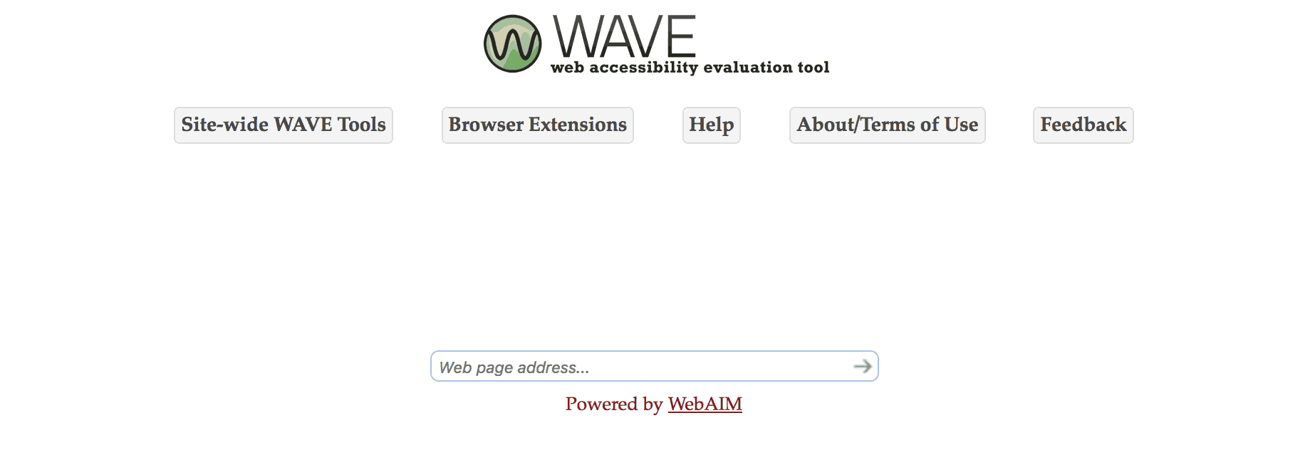
WAVE is very simple to use. All you need to do is enter your website’s URL into the field on the home page:
This will load your website, and add in hovering icons representing different site elements and potential accessibility problems:
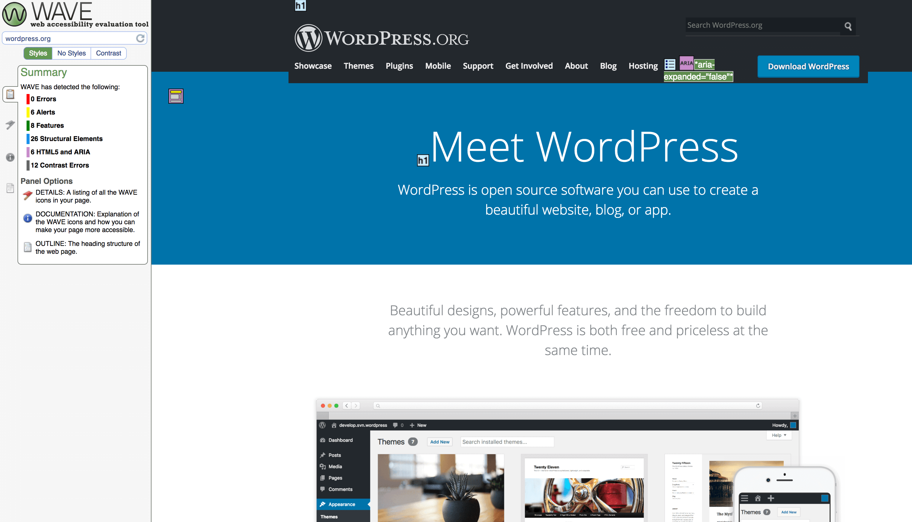
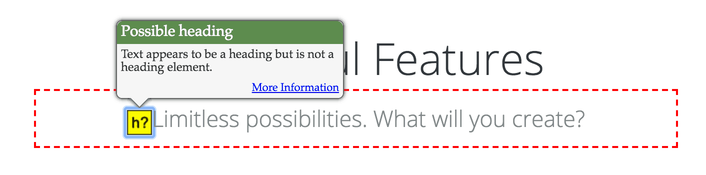
You can click on an icon to get more information about a particular element. If the icon represents an error or alert, clicking on it will explain why this element could cause an accessibility issue:
On the left side of the page, you can see a summary of the page’s overall accessibility. This shows the total number of errors, alerts, and page elements found:
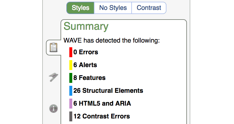
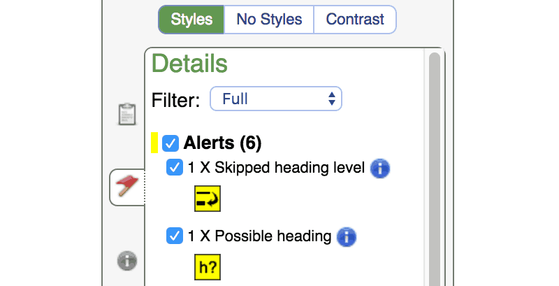
The tabs on the left contain additional information, such as a detailed rundown of all errors and alerts, and additional information about each selected icon:
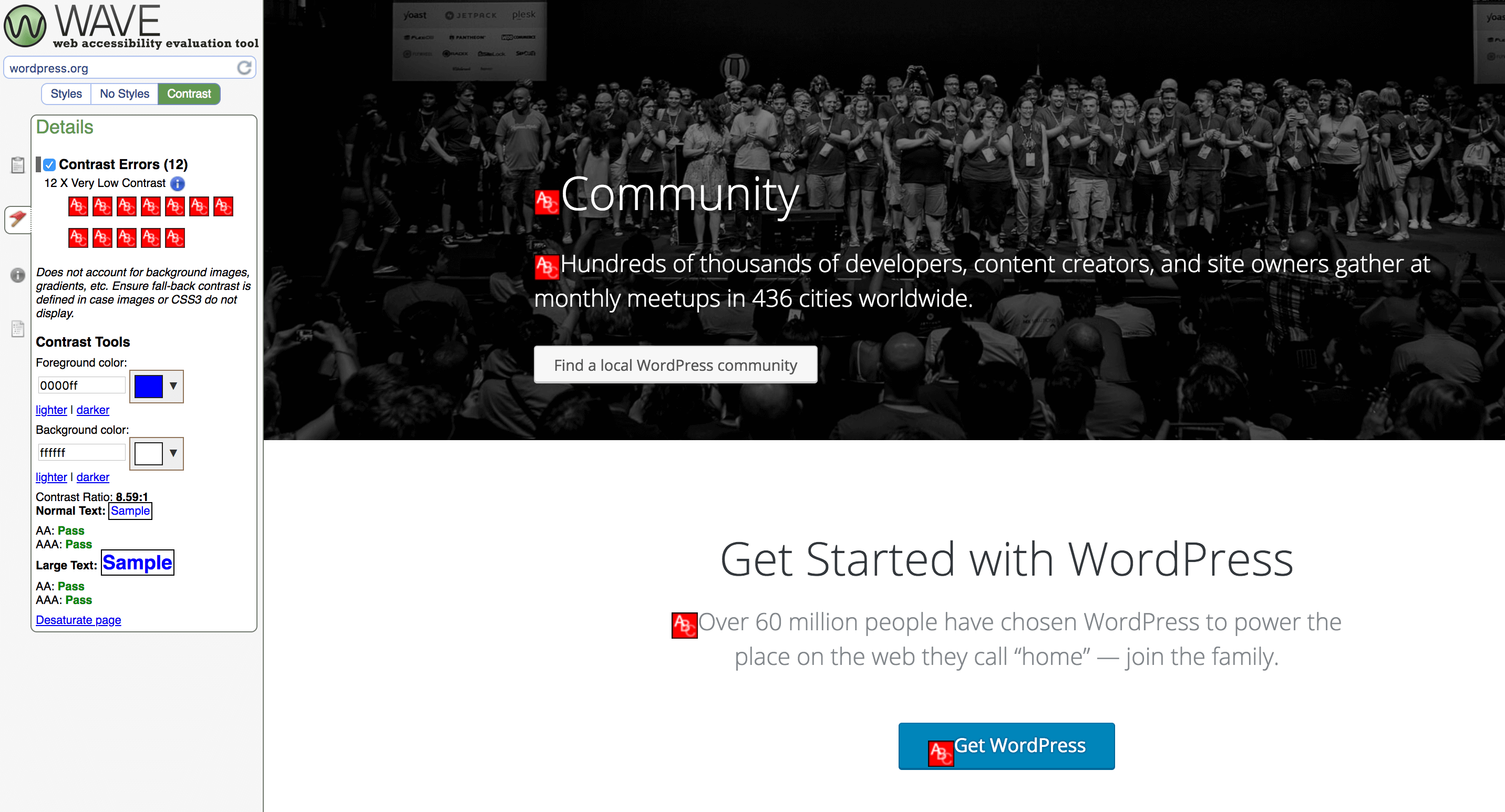
Above the menu, you’ll find buttons that let you view the site with styling applied (which is the default setting). Alternately, you can select No Styles to view it as plain text. You can also choose Contrast to see potential contrast issues with your design:
Using this tool will quickly give you an overview of where your site stands, and how it can be improved. It won’t account for every potential issue, and you should also have actual users test your site if possible. However, it will be immensely helpful as you aim to hit your accessibility goals.
4 Ways to Make Your Website More Accessible
The best way to optimize your site’s accessibility is to make a checklist of goals to hit when creating the site. However, you can improve accessibility for an existing site as well. To do that, we’re going to cover four easy ways you can ensure that your site is easy to use by as many visitors as possible.
1. Make Your Site Keyboard-Friendly
Keyboard navigation is an integral aspect of web accessibility. Users should be able to fully interact with and navigate your site using only a keyboard and no mouse. This enables visitors who can’t use a mouse, such as those with visual and physical impairments, to explore your site without problems. Some people use modified keyboards or hardware with similar functionality, and making your site keyboard-friendly will help them as well.
To achieve this, you should make sure all functionality on your site that requires a mouse can also be implemented with a keyboard. In general, every element should be accessible using the Tab key. This includes hyperlinks, buttons, and other interactive elements (such as text boxes). You should also provide a visual focus for keyboard users, which helps them see which element is currently selected.
Testing for this type of accessibility is relatively easy. Just try to use your site without a mouse. Check out all possible pathways, and attempt to use the various features. Are you complete a purchase, check your profile, and navigate to every page? If you find that you can’t perform an action using only a keyboard, you can use the WebAIM guide as reference for making improvements.
2. Consider Your Text and Colors Carefully
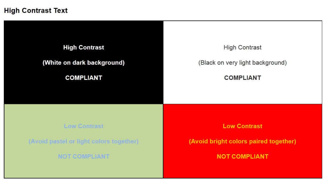
Color is naturally an important part of site design, but there’s more to it than choosing a palette that looks attractive. You should also consider how the colors you use will appear to people with visual impairments. For example, users with color blindness or low vision will often struggle if adjacent colors are too similar:
You can avoid this issue by using contrasting colors, which makes your content stand out from the background and improves visibility. There are plenty of tools that can help you test your current colors and create an accessible palette.
It’s also important to avoid flashing and strobe effects, especially with highly contrasting colors. These effects are known to trigger photosensitive epilepsy, and can be extremely harmful to some users. If your site does include such effects, you must provide clear warnings:

As for your site’s text, it should always be easily readable. So choose your fonts and text sizes carefully. Ideally, the size of text should be changeable, and you should use relative font sizes rather than absolutes. This way, the text will scale up or down dynamically, depending on the size of the screen being used.
Finally, you’ll also want to prime all text for screen readers. For example, if you have images containing text, you need to also include that content in the image’s alt text. The goal is to ensure that all information is accessible to every user.
3. Keep Your Navigation Simple and Clear
It’s important for users to be able to navigate your site easily. For some people, such as those using only a keyboard and no mouse, navigation can be a hassle on traditional sites. Consider pages that have giant menus, including dozens of links. Imagine yourself tabbing through each option every time you want to get to a specific page, and you can see how this might be a problem.
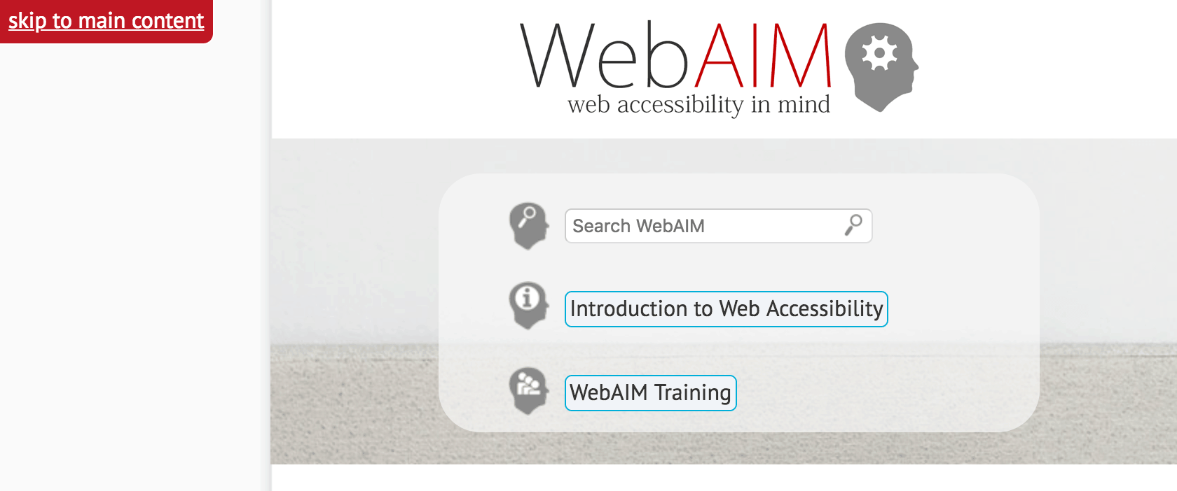
One way to deal with this is to create skip navigation links, which enable users to jump past the navigation elements and move on to the page’s content. If you’re worried about this negatively affecting the look of the site, you can simply make these links invisible, as they will still appear on screen readers. You can also configure these links so they only appear when you hit the Tab key:
You should also consider how you label your navigation. Vague terms like Go or Click can be a problem, if it’s not clear what selecting them will accomplish. A better approach is to set clear link and anchor text throughout your site. For example, instead of Go, you can use a phrase like Click to Read More.
4. Structure Your Content for Accessibility
Finally, remember that accessibility also matters when you’re creating content. For instance, you’ll want to carefully consider your content structure. Make sure that heading levels are consistent, and that header text clearly describes the content of each section.
You should also aim to keep consistent coding and styling throughout your site, to improve readability. This will make it easier for assistive tools to understand and read your content.
Web accessibility is something you’ll need to maintain over time. Whenever you add new pages, posts, media, and design elements, you should consider how they will affect your site’s overall accessibility. The Web Accessibility Initiative offers an excellent guide for ensuring that the structure of your site and pages are optimized, which is a useful reference.
Conclusion
If your site isn’t welcoming to as many people as possible, you’re doing both your audience and yourself a major disservice. Taking steps to make your site more accessible will not only make your visitors’ lives easier, but it will improve your site and can even increase its traffic.
Throughout this post, we’ve touched on some of the most important factors to consider when making your website accessible. You’ll want to:
- Make sure your site is keyboard-friendly.
- Consider your color and text choices carefully.
- Keep your navigation simple and clear.
- Create accessible content.
Do you have any questions about website accessibility? Let us know in the comments section below!